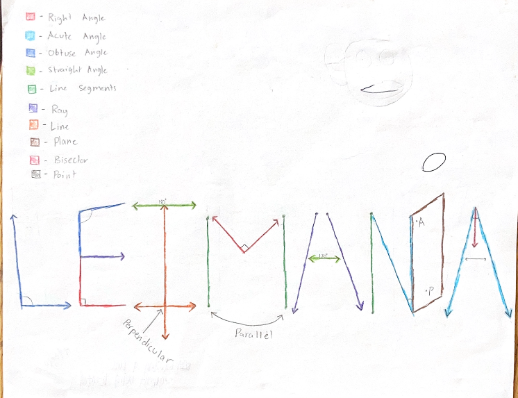
This is the Logo Graphic Design project. It was assigned to us by Ms. Marsh for Geometry. The goal for this project was to ensure that we comprehended the lessons on Angles, Lines, Planes, etc. We added an artistic portion to it by incorporating our name into it. As you can see below, I did my first name and at the top of the page you can see the key. I was proud on how it came out and I loved how simple it was.
Why did you choose to show this work sample on your Portfolio?
I was really proud on the outcome. I'm not a very artistic person, so the way it came out made me happy. And the unit itself was really enjoyable to learn about.
How does this work sample represent a 21st Century SKill?
I think this work sample is a perfect example of my thinking and problem solving skills (among others). First of all, I'm not an artistic person (and I know that the project may not look like it required a lot of art skills, but it did for me), so I had to figure out how minimalistic I can make it while making it look good at the same time. As far as the actual information incorporated into the project goes, that also took some thinking. I had a number of things I had to fit into my name so lots of thinking and problem solving skills went into trying to make sure I put the right things in the right places.
How does this work sample demonstrate your growth? Is there something you could've improved on?
As far as growth grows, I'm not sure that this was a very good example of it. Compared to other projects, this project was way simpler and easier requiring less effort thus not much growth was made. With that being said, there was plenty of room for improvement. I know neatness was one of the aspects that I really could've improved on. It was pretty messy and there were impurities that I could've fixed if I had just put a little more time into it.
